taken/modified from http://euphrates.wpunj.edu/courses/arts350/aesthetics.html
1.) Importance
What's the most important thing in this layout? Is it the most important, most attractive or most convincing part of the message? What's next? What's last? Once you know what's most important, use visual emphasis...perhaps make it bigger than the rest, change its color, or think about where it should be placed.

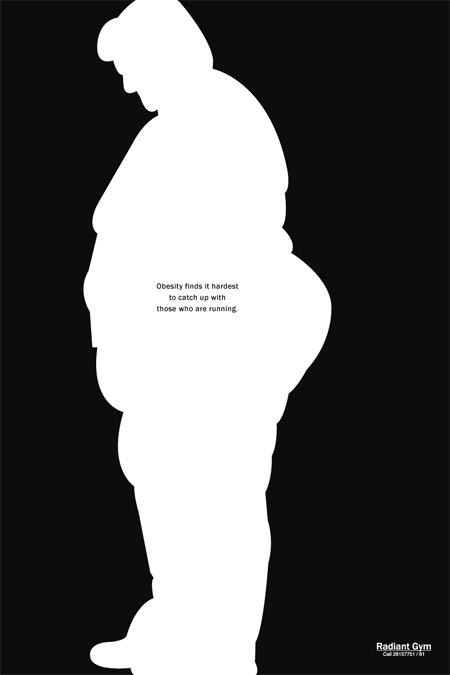
2.) Contrast or Opposites -big/little, crowded/open, orange/blue.
Contrast help's get people's attention which helps you set importance, focus attention and create drama.
6.) Rhythm -variety and pattern. 7.) Flow -leading the eye across the surface. 8.) Depth -leading the eye beyond the surface, or making things jump out from the surface. 9.) Scale -the illusion of size. 10.) Movement -the illusion of physical interaction among elements. 11.) Unity -that which holds the piece together.


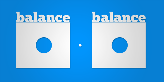
3.) Balance -creating a gravitational axis.
Variety relieves the eye, and pattern helps the mind make sense of it. In multipage works, rhythm creates pacing across the whole.
This should happen in a desired sequence.
Depth is the most inherently contradictory illusion of 2D design, and therfore, one of the most compelling.
The size of elements relative to one another is important, of course, but the size of things in relation to the format and the size of the format itself are also worth considering.
Usually figurative -with elements angled or poised like bodies in motion -movement can also be created with such optical effects as linear repetition, visual vortexes and the like. Used deliberately, suggested movement can have a marked emotional and physical impact on a viewer.
Color can unify a design, as can a grid, visuals that represent related subjects or a consistant style of imagery. In an age of over-stimulation and cacophony, unity is often underrated.
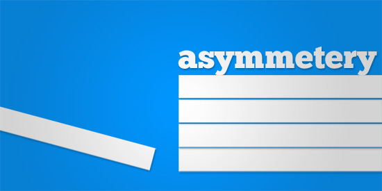
Balance doesn't have to be symmetry. By opposing dense detail with open space, or heavy elements with lighter ones, balance can be asymmetric and, again, athletic.